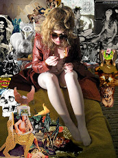
not sure how happy i am with the colour of the dirt, and i want to take some of the ultramarine out of the cans on the left because they're distracting.
I also need to fill in the other patches.
Any other suggestions or observations?
Acid Cougar

This is an idea I have for a post card. I want to make it more cougar-like, right now I feel uncomfortable with how similar it is to my reference. I was thinking of making a hole punch shaped like an acid tab and punching out a little square in every cougar's tongue. I think I need to let this piece kind of weigh my mind a little and then I can come back to it and apply a concept which will then lend depth and further composition/imagery clarity.


2 comments:
I think the ultra marine will work if you punk up some of the same blue in the patches somehow. That way, your eye will travel a bit. I really like how it came out.
I love it with more color throughout. I think if you could add a subtle color wash in the upper right corner to balance the stronger colors on the bottom, that would help too. otherwise it is awesomeness.
Post a Comment